Quality Attainment and Assessment Radars
* What variables are dominant for a given observation?
* Which observations are most similar, i.e., are there clusters of observations?
* Are there outliers?

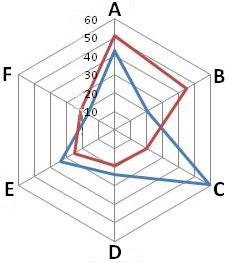
Radar charts are a useful way to display multivariate observations with an arbitrary number of variables. Each observation is represented as a star-shaped figure with one ray for each variable. For a given observation, the length of each ray is made proportional to the size of that variable. Radar charts differ from glyph plots in that all variables are used to construct the plotted star figure. There is no separation into foreground and background variables. Instead, the star-shaped figures are usually arranged in a rectangular array on the page. It is somewhat easier to see patterns in the data if the observations are arranged in some non-arbitrary order, and if the variables are assigned to the rays of the star in some meaningful order. Each star represents a single observation. Typically, radar charts are generated in a multi-plot format with many stars on each page and each star representing one observation. Generally, radar charts are used to examine the relative values for a single data point (e.g., point 3 is large for variables 2 and 4, small for variables 1, 3, 5, and 6) and to locate similar points or dissimilar points.

